Comcast Sales
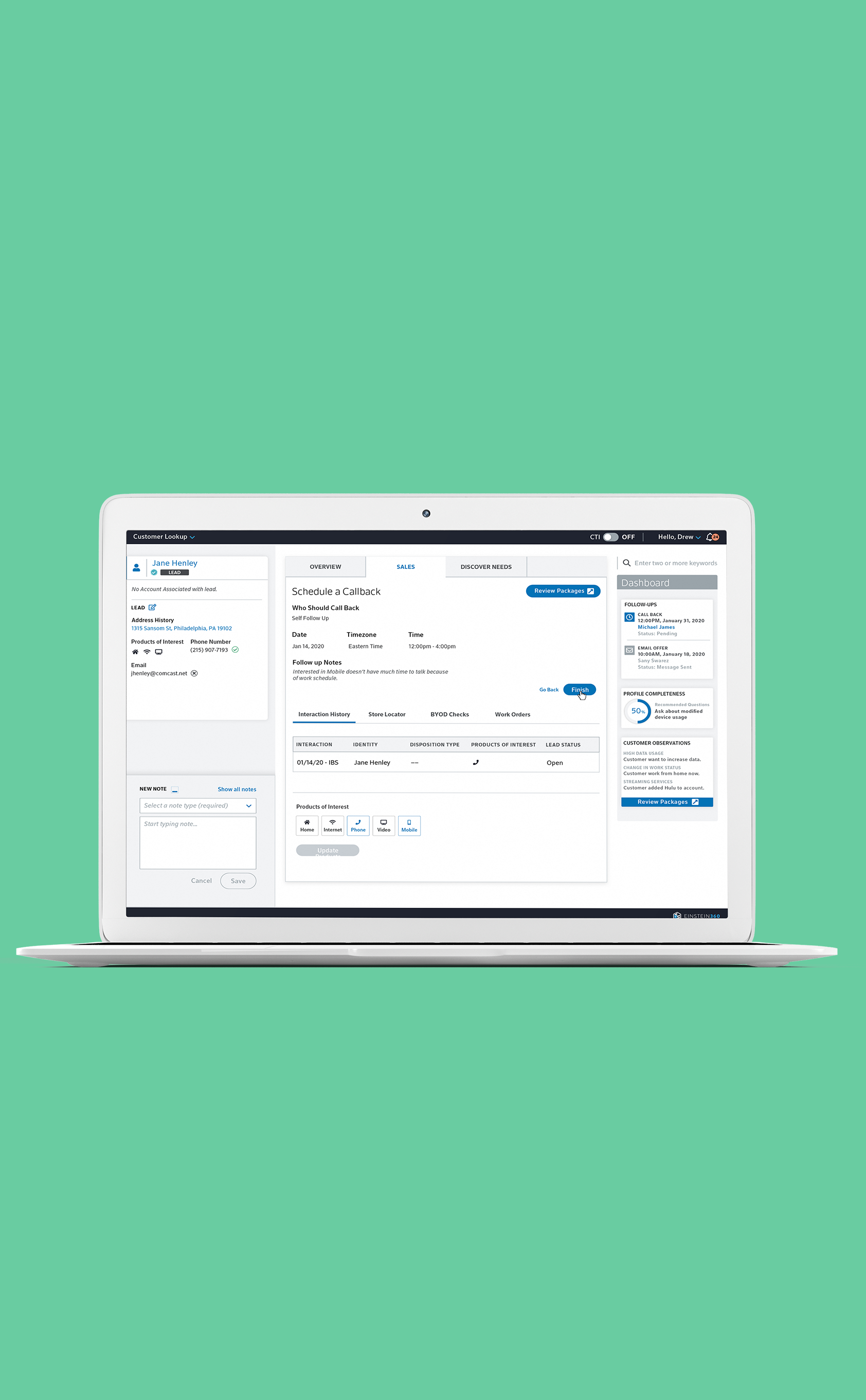
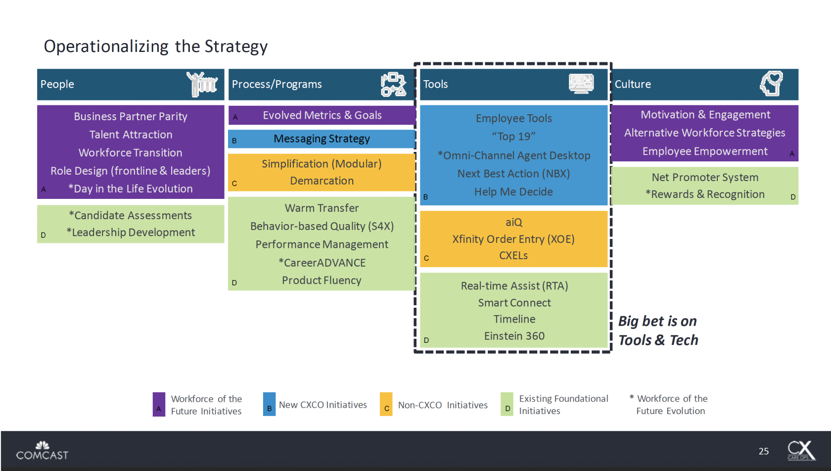
Sales agents were in need of their own space within the Einstein 360 Customer Relationship Management (CRM) tool. Einstein 360 was initially created to help Repair and Care Agents, but Sales Agents have unique problems to solve for their user, and needed a space that accommodated their workflow.
MAJOR ROLES:
PRODUCT DESIGN, UX/UI
DATE:
FEB. 2021- JUNE 2021
EMPLOYER:
THINK COMPANY
Background
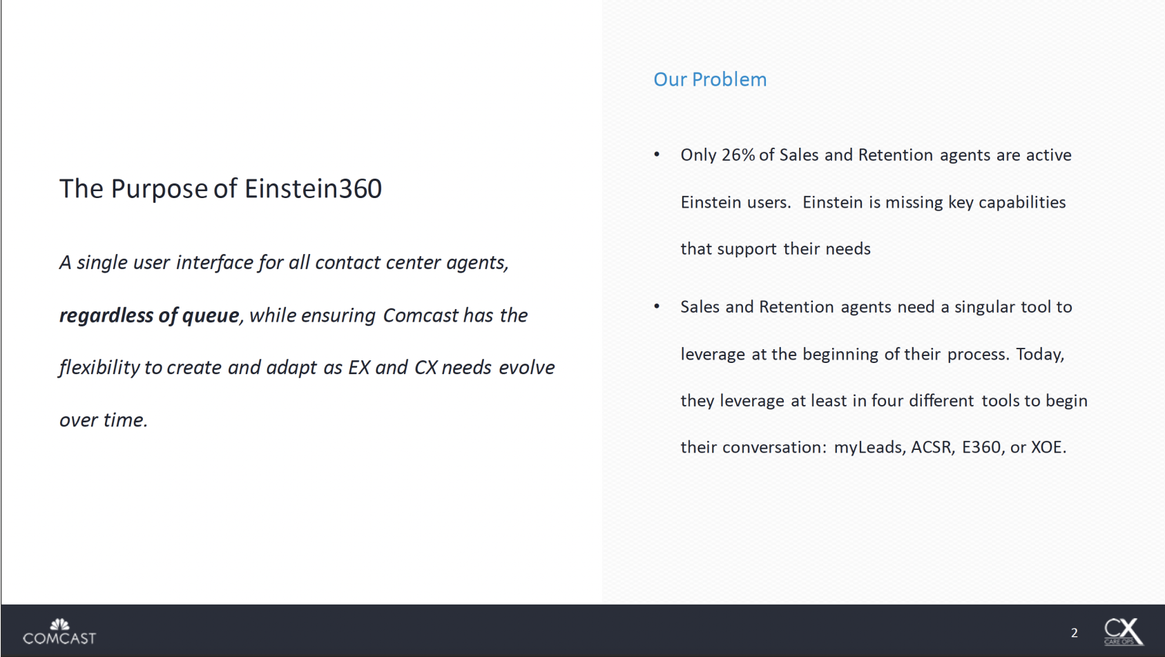
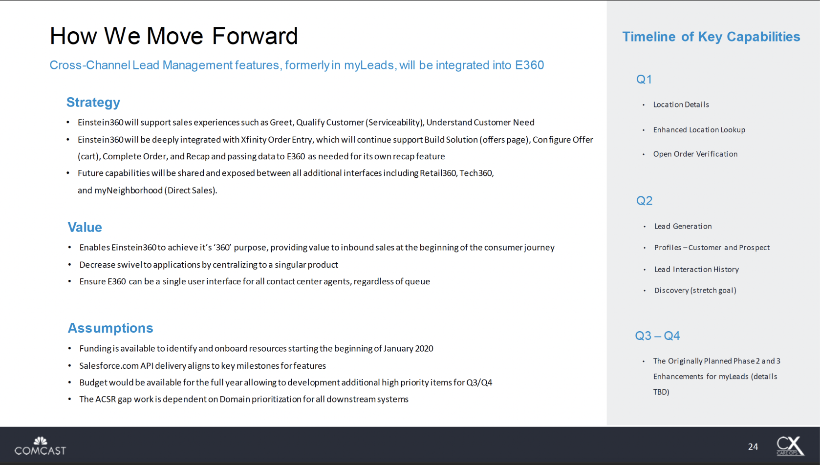
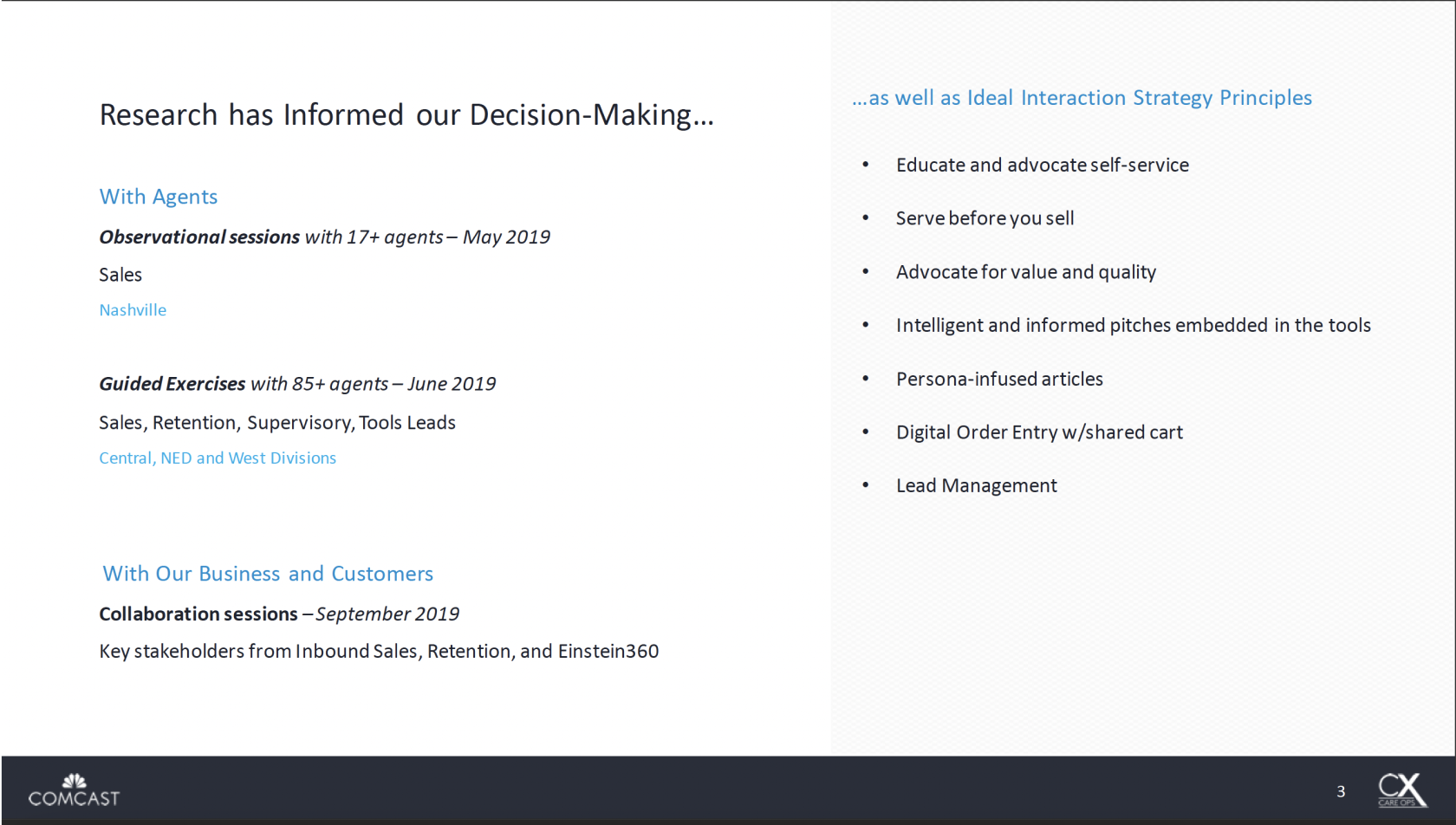
In 2019, researchers in our internal team conducted a years worth of research to determine what capabilities Sales Agents were missing in the Einstein 360 platform, how this impeded their overall efficiency, and ways to resolve this problem. After doing observational sessions with 17+ agents, guided exercises with 85+ agents, and collaboration sessions with key stakeholders, our researchers determined a couple very important incites. First was that only 26% of Sales and Retention agents were active users in Einstein, and that these agents were forced to hop between multiple platforms in-order to do their job. Second was that Sales agents needed a one-stop-shop to do all their work; which includes a profile for incoming prospects, a customer profile, lead generation tools, etc. The presentation below goes into more detail about the data collected from their research, once we knew what the problem areas were it was time to begin the UX design process.
Challenge
We needed to create a separate space within the Einstein 360 platform that still felt on-brand, and this posed a couple challenges. The most daunting one was that the workflow of a Sales and Retention Agent is very different than that of a Repair Agent. Einstein was built to be very flexible and loose, so that an agent can jump from task to task without friction. However, a Sales/Retention Agent’s workflow tends to be more step-by-step, they needed a platform that was organized by how they work through their calls with varying customer types. As a result, this required a brand new architecture within Einstein. This re-work coupled with designing a new platform that was meant to look different from Einstein, but still have brand integrity, with the design support of only myself and another researcher was a huge undertaking.
Applying OOUX
In order to tackle the information architecture we used Object-Oriented User Experience (OOUX) Model. OOUX is a philosophy for designing digital systems that respects the fact that people think in objects — and need consistent, recognizable objects to understand an environment or product. For example, Einstein 360 was designed to think actions first, they know that repair agents have to troubleshoot problems in the home, so they created a troubleshooting page that contains any information (also known as objects) that has to do with troubleshooting. On the other hand, following a OOUX model a sales agent consider who they are working with first (the object); for instance a primary customer, and then they want to see a customized list of actions they can do with this particular person.
For one week myself, a researcher, an architect, and our stakeholder laid out the flows we expected each customer or prospect type would go through with the agent. You will see in the video that we applied OOUX methods to create workflows, so anything that is an object is colored blue and anything that is an action was red. This session was very beneficial in aligning our expectations for what we thought should go on each page, and we found out that OOUX is very similar to how developers group information when coding. Once we were aligned with our four main flows and edge cases for the MVP, we digitized them and shared it with the the Divisions.


Design Process
Once we were aligned on what was going on each page, we needed to determine how it would look. My goal was to keep the colors, icons, typeface, and components; such as, buttons, tables, drop-down menus, etc. as close to the look and feel of Einstein as possible. However, simplicity was key for the re-design, removing unnecessary actions, reducing jargon, and streamlining the process was vital to make the experience more useful for Sales/Retention Agents. I went through a series of sketches, low-fidelity wireframes to land on our final direction.
Once the MVP was created testing was key, myself and the researcher conducted 12 guided usability sessions with Sales/Retention Agents from different Divisions to test functionality and architecture. Overall the feedback was largely positive, but we did determine some key areas of opportunity to improve the experience.
Key Takeaways + Areas of Opportunity
Agents wanted a lead created for a prospect to appear visually different than a lead created for a customer, so they would not get confused between the options.
Sales Agents wanted to be able to track the interaction history of what was done for a lead.
Retention Agents wanted friendly language on the profile, that mirrored how they would speak to the customer.
Sales Agents wanted a review screen, so they can double check any information they put in on a lead before submitting it.
QA Auditing
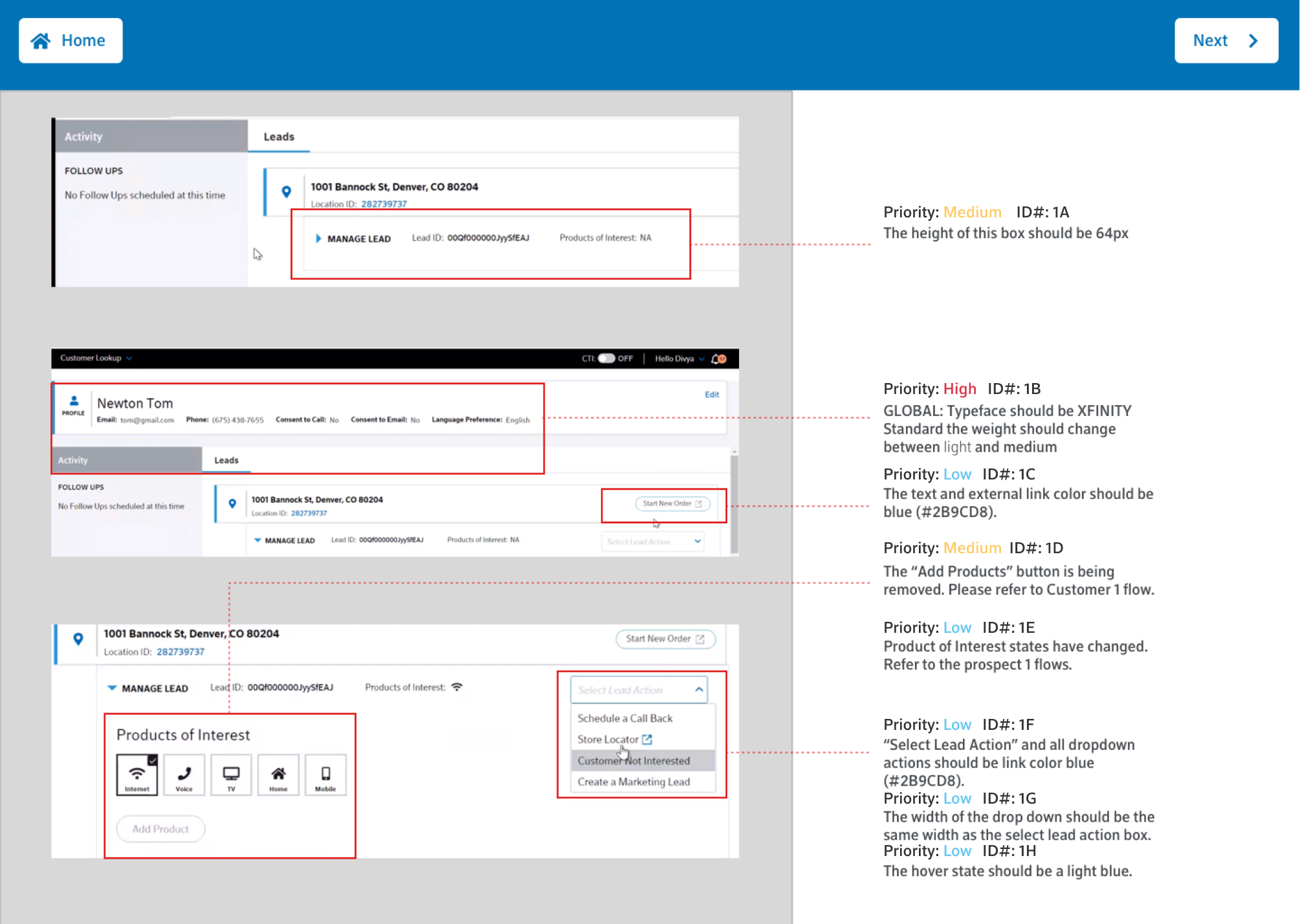
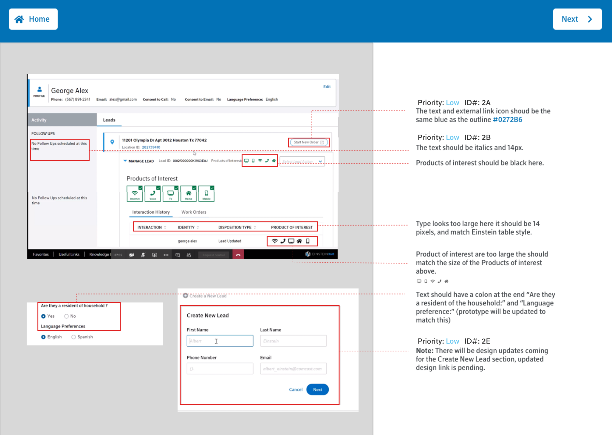
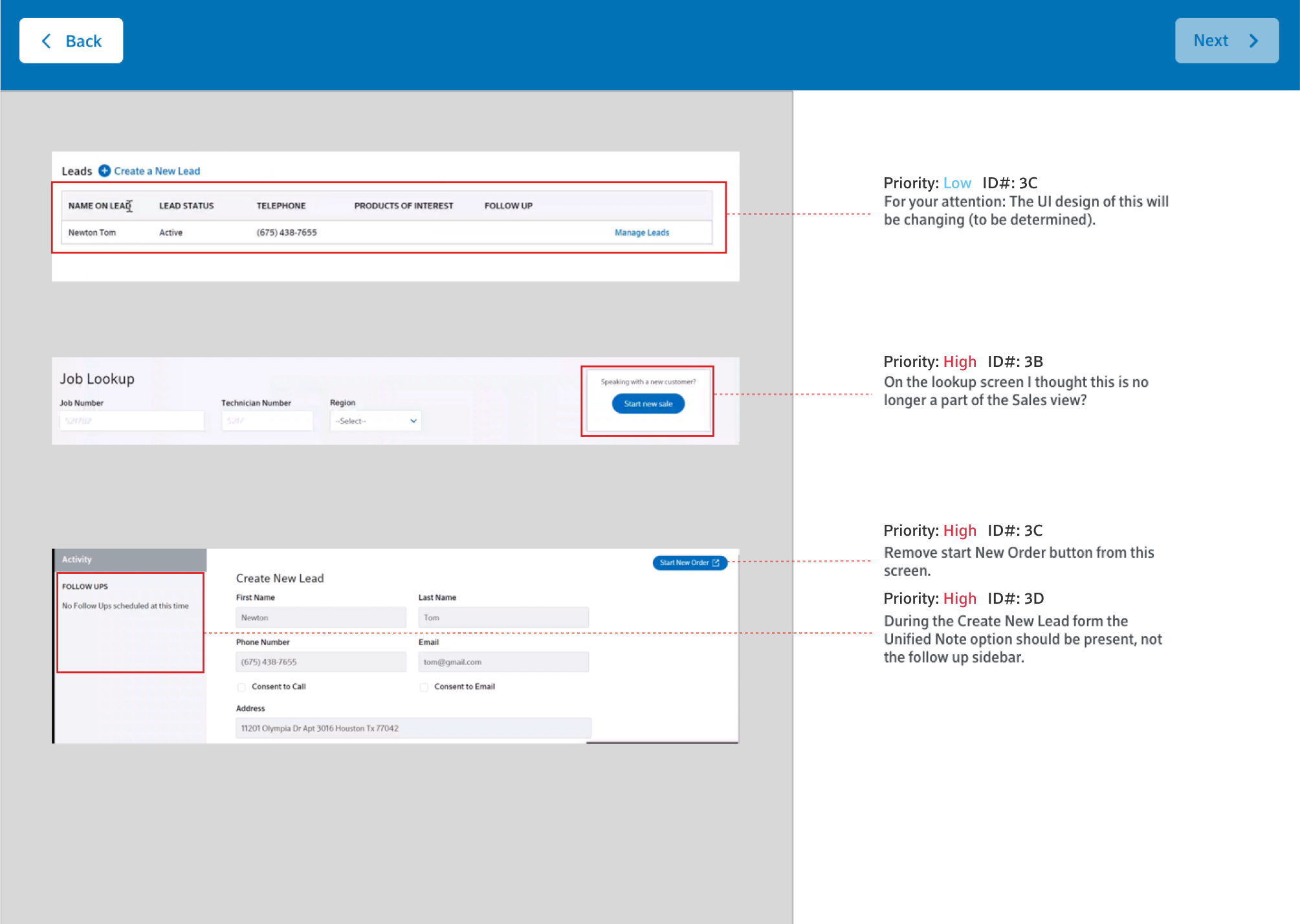
When our designs were validated it was time to begin development. Because the architects were brought in early the handoff was pretty seamless. In the past, audits were done during a meeting where everyone provided feedback, but I realized that key details were getting lost. As a result, I recorded developments demos and created a reusable template in Sketch that included detailed feedback, a ranking on priority, and an ID number that could be added into Rally tickets.

Applying OOUX to this project was not only beneficial to the re-design, but really improved our communication to development, and allowed us to work with our stakeholders without getting caught in the weeds of design. This process worked so well that we shared it with other Teams at Think Company to infuse into their UX process.


