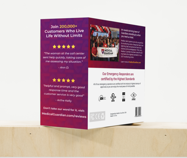
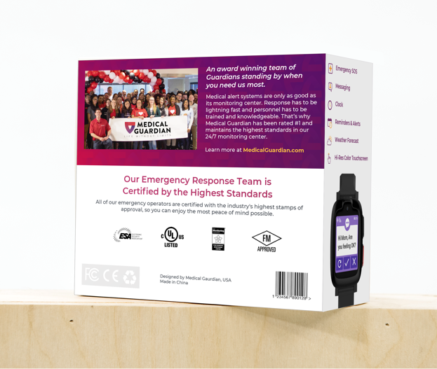
Medical Guardian
Medical Guardian is an American medical alert systems provider headquartered in Philadelphia, Pennsylvania. The company has appeared in Inc. Magazine’s list of 5000 fastest-growing companies four consecutive years in a row from 2013 to 2016.
MAJOR ROLES:
Web Design, UX/UI, CRO Strategy, Branding
DATE:
December 2018
EMPLOYER:
Muhlenhaupt
Background
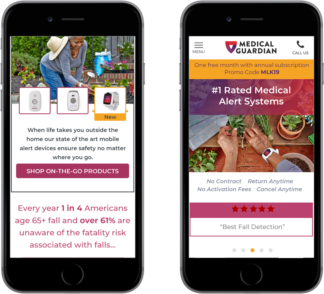
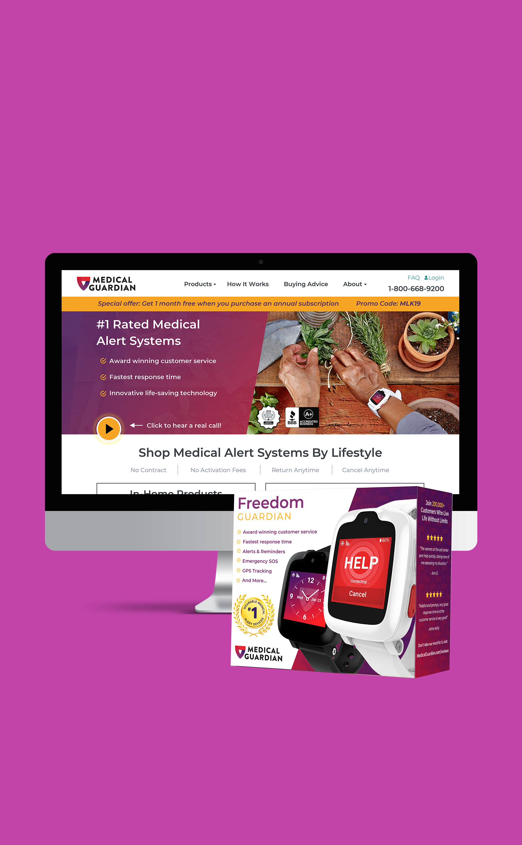
Medical Guardian, the #1 rated medical alert system, was searching for ways to increase online and phone sales using a unique approach to Conversion Rate Optimization (CRO). However, the company lacked the in-house user experience designers and conversion strategists to accommodate its desired results. After realizing this was a major gap in their online performance, I was tasked, alongside with our UX strategist, to re-design landing pages and increase conversions.
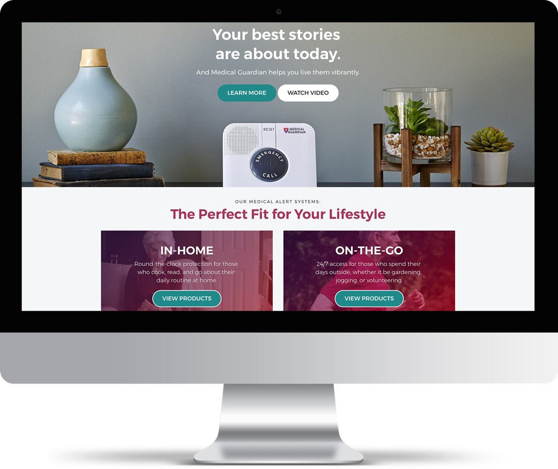
MEDICAL GUARDIAN LEGACY WEBSITE
Challenge
The challenge was identifying areas of weakness and opportunity in the legacy website experience and through research and testing prove that our strategy and design approach could provide not only a more usable experience for their diverse audience demographic, but also an increase in sales.
Process
In order to succeed in this project, we knew that all design decisions had to be backed by data and research, which is why we quickly dove into any and all possible resources to gather information about the current user experience. Our analytics team focused primarily on statistical information, and I focused on the target demographic and their needs.
The primary audience in need of Medical Guardian products are individuals 50+ years old – and after hours of researching accessibility principles, I soon realized much more was required to redesign than our team originally envisioned. Not only was it important to identify the physical limitations that may come with this audience, but generational differences in computer experiences, and technological limitations played a vital role in a users experience on the site. Once I had the data to back up usable design decisions, I was able to thoroughly audit Medical Guardian’s website, and provide recommendations on design decisions that could significantly improve the user experience on the site.
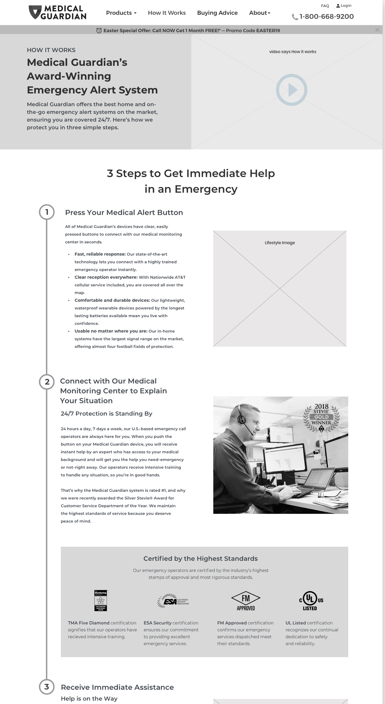
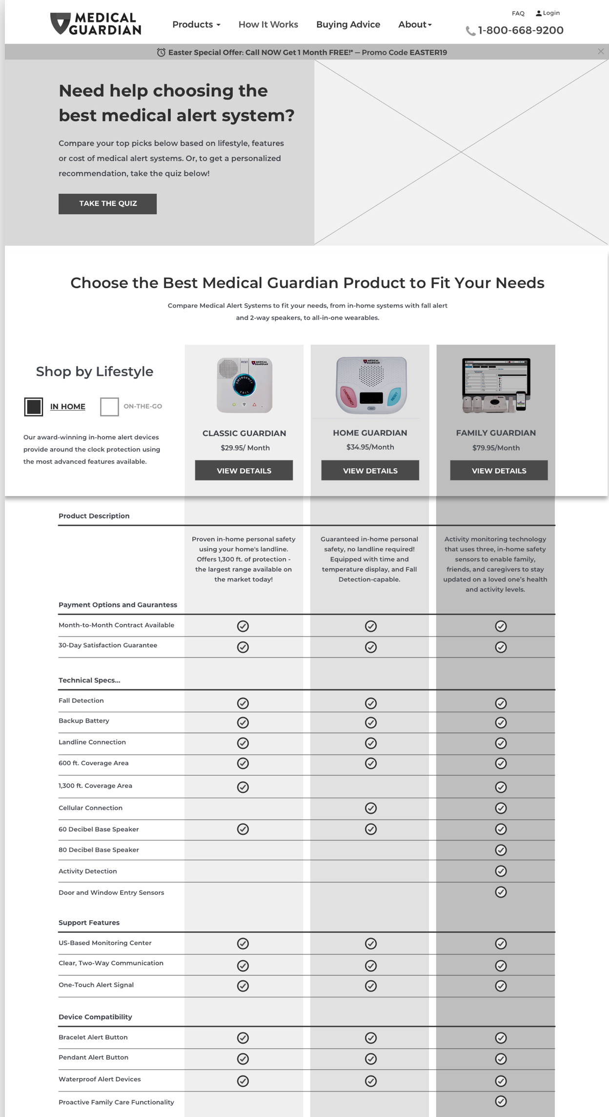
After the re-design of the homepage, 89% of people stayed on the page longer and scrolled 49% more.
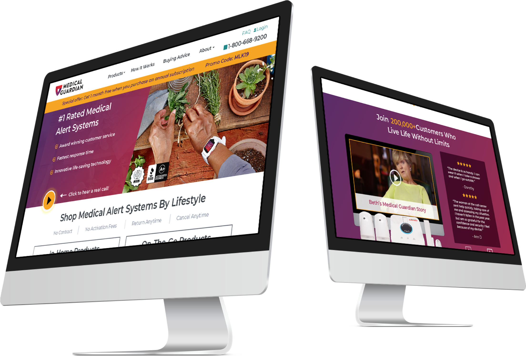
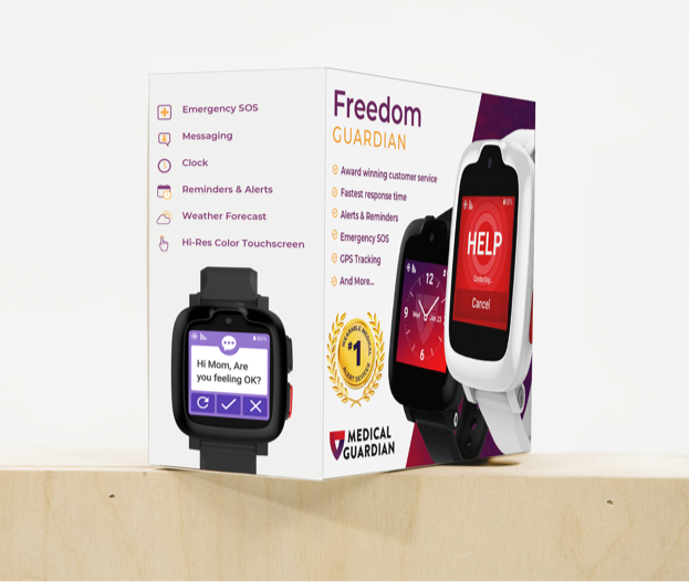
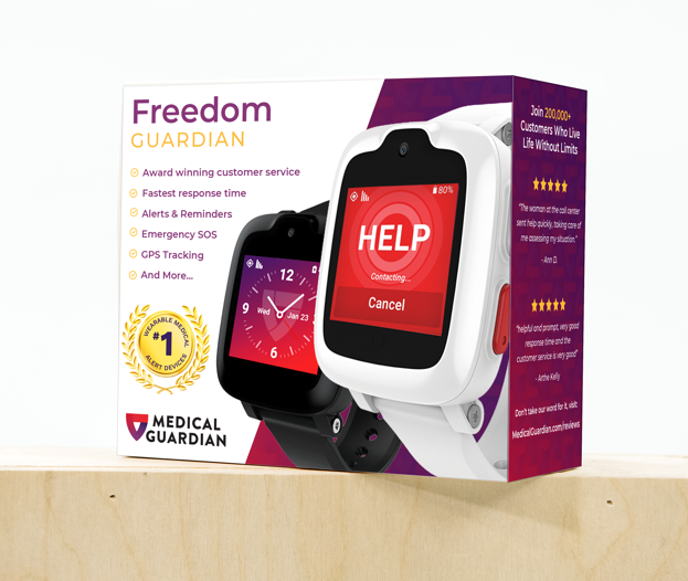
The overall strategy of the homepage based on key CRO principles and UX research increased online web orders and reduced cost per sale. Medical Guardian was so pleased with these outcomes, that they asked us to apply these principles to their packaging and create a design that could push their products off the shelves in stores across the country.
