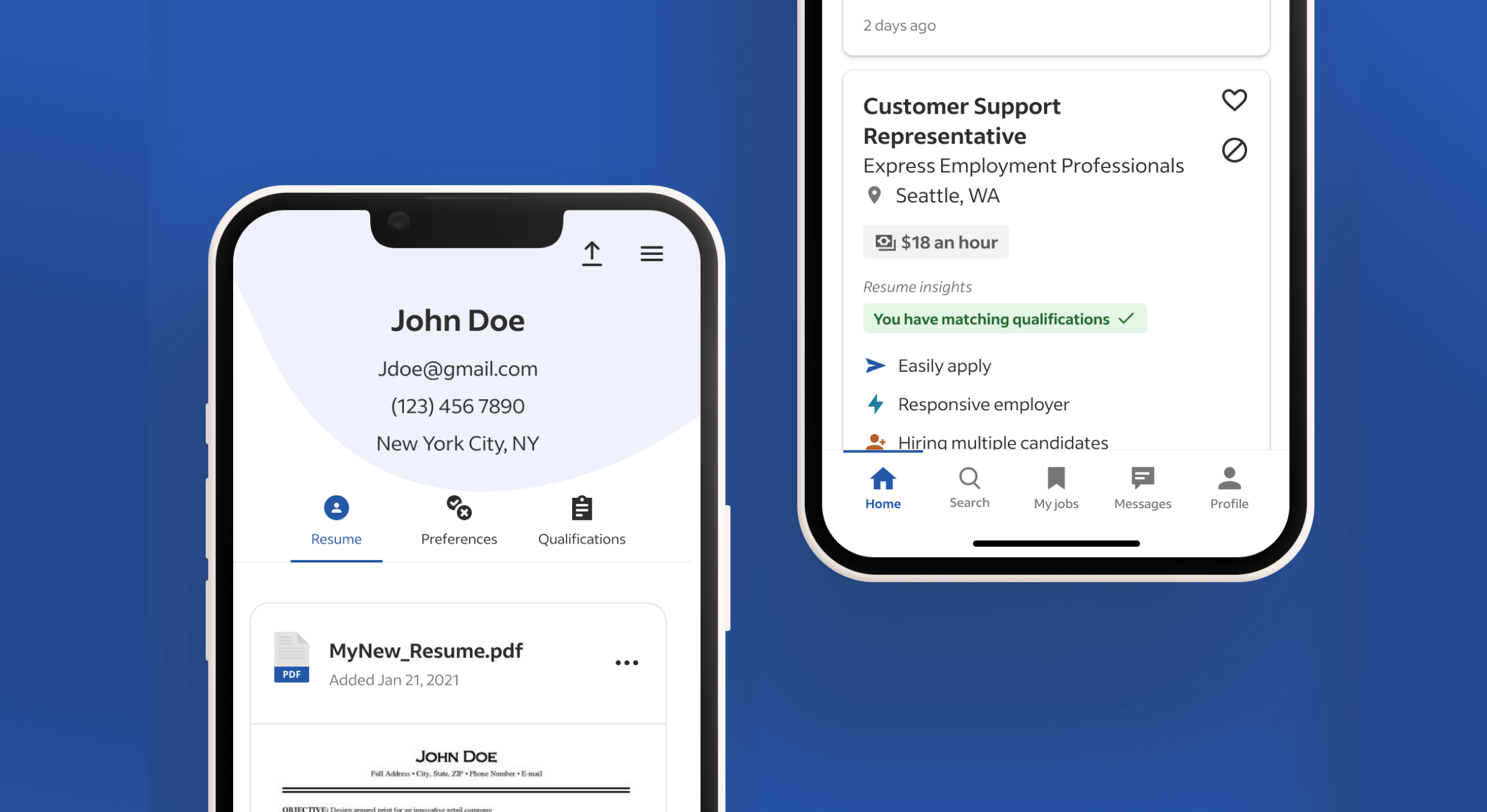
Improved App Navigation
The previous navigation adhered to standard web patterns, but the app’s navigation required a complete redesign to meet industry standards. This involved a thorough rethink of the information architecture (IA), including the introduction of bottom navigation, revamping the hamburger menu, and ensuring consistent header treatments.
MAJOR ROLES:
Product design, Mobile Apps
DATE:
June 2023
EMPLOYER:
Indeed
Background
Indeed used a hamburger menu as its primary navigation on every page of its product. The menu contained an extensive list of rarely used tools. Additionally, many of the links led to broken pages and provided a buggy experience. Lastly, the page headers had inconsistent labels and navigational elements, making it difficult for job seekers to understand their location within the product.

Challenge
In order to meet industry standards, we understood the importance of approaching navigation comprehensively. This involved considering both bottom and top navigation while minimizing reliance on the hamburger menu. Identifying the features to prioritize necessitated extensive collaboration and communication with all product teams throughout the company.
Auditing the Current Navigation:
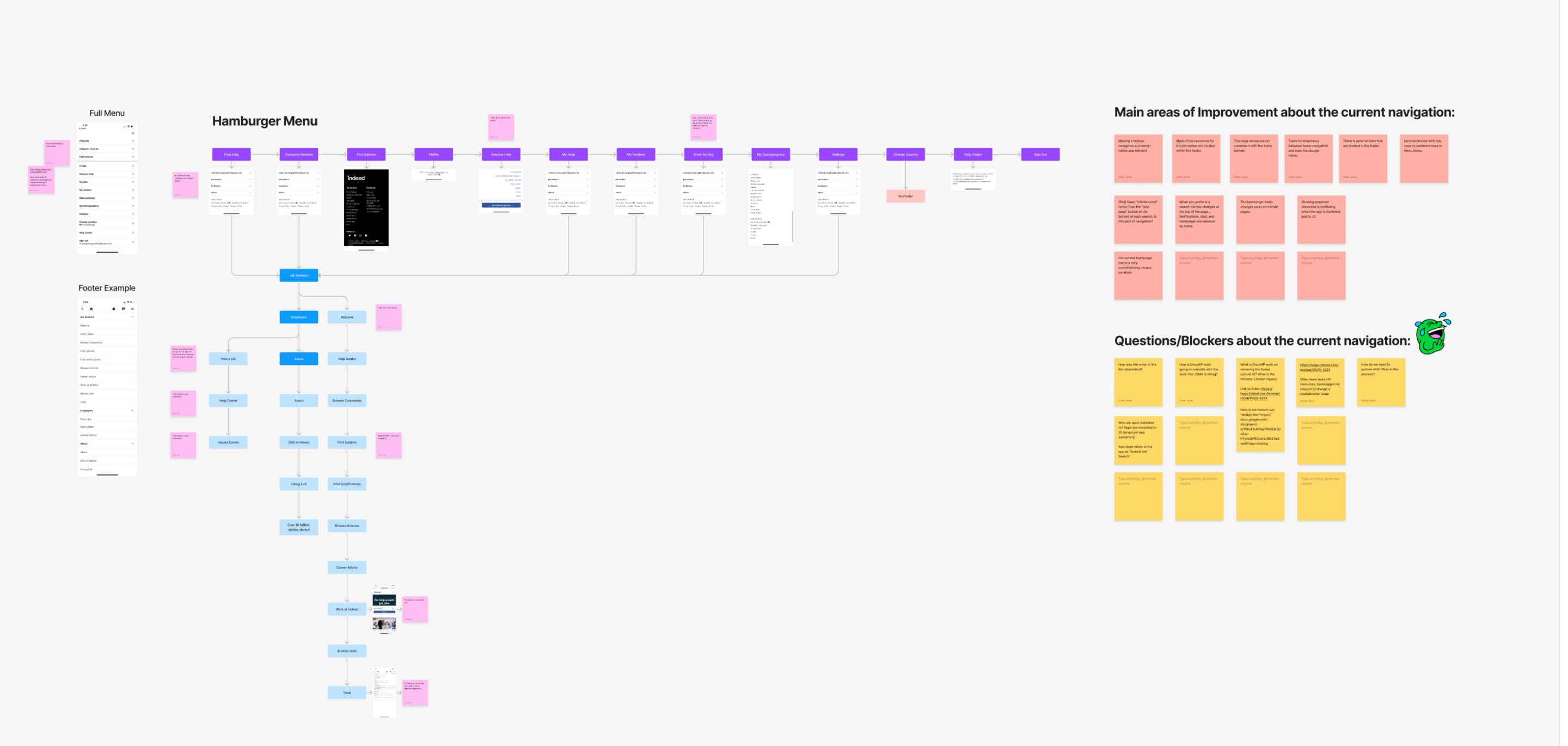
Before implementing new navigation, I sought to gain a better understanding of the current navigation in the product. I created a site map of the current experience and completed an audit to identify repetitive elements, broken experiences, and confusing behaviors.
Competitive & Comparative Analysis
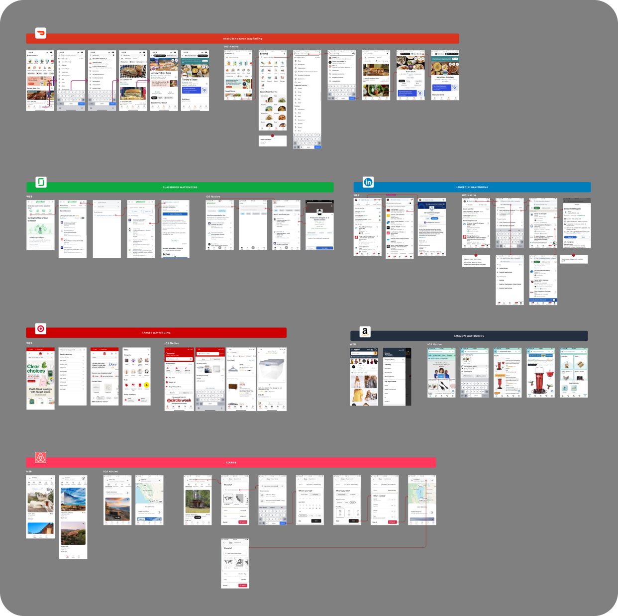
I conducted a review of competitors and other modern apps to analyze how they use navigation. I noticed that the hamburger menu typically only appeared on the profile screen and mainly contained account-level settings. The bottom navigation remained consistent with core app functions, while the top navigation could be customized for specific pages. Additionally, I observed that icon labeling varied across products. For apps targeting younger users, labels were less common, encouraging exploration. In contrast, more professional apps targeting an older demographic usually use labels for a more accessible user experience.
Navigation Alignment Workshop:
It was crucial to have alignment across the organization regarding the changes we wanted to make to the core navigation. Initially, the request was simply to add bottom navigation, but I believed it was important to take a holistic approach to navigation. As a result, I organized a workshop for the team to examine the current information architecture (IA) breakdowns, explore the product, and identify additional areas for improvement. I then had them review their favorite products to identify functionality and themes within their navigation that worked well. I encouraged them to not only consider what elements lived on the pages, but also how they behaved, including animation or gestural behaviors.
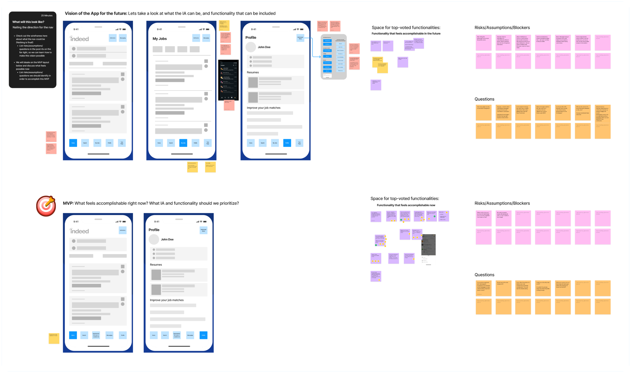
This process allowed us to create a comprehensive list of enhancements to enhance the app experience. Finally, determined the 4-5 key features to include in the bottom navigation. This was challenging because the teams at Indeed were divided by product pages, and each team wanted to include their pages in the bottom navigation to improve metrics. Ultimately, we relied on user research to determine the core functionality that would help users achieve their goal of getting a job, which resulted in Home, My Jobs, Messages, and Profile being included in the bottom navigation.
MVP Designs
As we worked on the MVP designs, we realized that making major changes to the information architecture would be disruptive for users. Therefore, we focused on making minimal UI enhancements to ensure a simple and consistent user experience across all pages. Since the navigation would be visible on every product page, it was important to create designs that seamlessly integrated with the existing layout. I iterated on the navigation design continuously and conducted weekly design reviews with engineers and product managers from Android and iOS teams until we finalized the MVP.

Usability Testing
Before starting the building process, we conducted a 3-week research study to test the usability of the navigation for job seekers. We asked them to perform common tasks they would do on an app and observed how they moved through the navigation. The majority of participants preferred the bottom navigation. They felt it better matched other app experiences they were using and made it slightly easier to access parts of the app they would most commonly use. Overall, the usability of the prototype was good. Participants completed all navigation tasks without any serious difficulty and felt it would be easy to learn the new navigation layout.
Rollout Plan
Despite the apparent simplicity of the project, previous teams have tried to implement bottom navigation several times over the years, but they could never overcome the complexities of the information architecture, backend logic, and the challenges it posed to teams across the organization. To avoid these issues, our approach to navigation took into account the constraints of both iOS and Android simultaneously. I collaborated with both engineering teams, understanding their unique constraints and designing for all their specific situations. As a result, we were able to design, build, and implement the navigation at 5% on both platforms in under 4 months. This marked the first successful cross-platform build at Indeed using an agile method, as opposed to the traditional waterfall approach from one platform to the next.
Six months later, the navigation was fully released across the United States on iOS. There are plans to release it in the rest of the world by June 2024. Android had implementation bugs when interacting with pre-built pages, but it reached a 100% release within the United States by May 2024.
Design Iterations and Testing
We were aware that we needed to make immediate improvements to the navigation, but we wanted to be careful about how we tested it and shared it with job seekers to minimize disruption. As a result, we planned to release the changes in increments of 5% so that we could measure the performance and impact of such a high-touch feature.

In Phase B of the navigation design, we focused on making the UI more accessible. We added bolding to the selected states of the navigation, included a horizontal line at the top of a selected tab, changed color contrast on the top navigation, and included more gestural behaviors. Additionally, we needed to design for more edge cases, such as linking between tabs and external links to the app. The navigation is a continuously evolving feature that we continue to iterate and test on.
Sharing Knowledge Across Indeed
The introduction of the navigation brought a lot of attention to the Indeed app from teams across the organization. Everyone wanted their pages featured in the bottom navigation because it is high-touch real estate but were not thinking about the app experience holistically in the user’s journey. We needed to shift our company mentality in terms of navigation, so I led the process of developing material to teach teams how to approach navigation with a mobile app mindset.
Leading Async Workshop
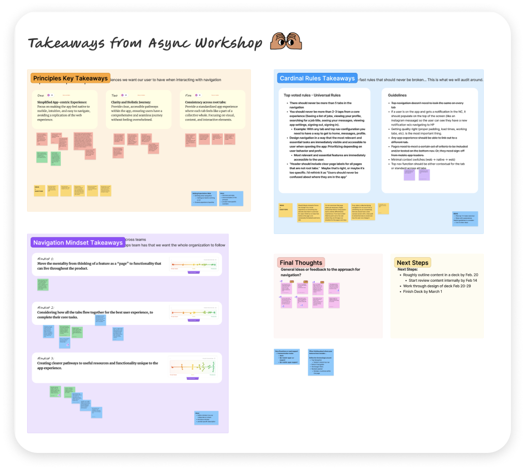
When we created the MVP, we naturally established parameters for the bottom navigation, top navigation, and hamburger menu. However, we didn’t have these ideas clearly communicated to external teams. To address this, the first thing I did was organize an async workshop that was shared across Indeed design teams to confirm the principles, goals, and rules behind navigation and prioritize what was most important. This alignment ensured that our teaching materials about a mobile app mindset were representative of individual team goals and did not surprise anyone.
Presentation to Organization
I proceeded to develop the presentation, which was shared with hundreds of designers, engineers, and product managers across Indeed. Additionally, I conducted multiple teaching sessions at Indeed to ensure that people understood how to introduce features to the navigation with a holistic mindset and to consider the placement of their features thoughtfully.


