Smart Matches
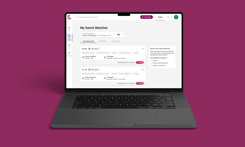
This experimental tool used the repository of job seekers found in SimplyHired and Indeed, and based on their skills we would match them to an employer, who could then invite the job seeker into the interview funnel.
MAJOR ROLES:
Web design, Employer ATS
DATE:
February 2022
EMPLOYER:
Simply Hired | Indeed
Background
After a job post is created there is a period of time when the employer has to wait for applicants to apply for the job. The goal was to mobilize the employer to reach out to qualified candidates and invite them to apply. With Smart Matches the goal was to expedite the application process and connect qualified applicants to the employer.

Challenge
We needed to provide the employer with sufficient information about the candidate to aid in making an informed decision about inviting them for an interview, while also ensuring the information is easy to skim and engaging for the employer.
Planning Process
This was the first time SimplyHired had offered any kind of recruiting service within the platform, so it was important to obtain references to other business solutions. I audited competitors like ZipRecruiter and Monster and identified strengths and weaknesses within their platforms. Additionally, I conducted comparative research to gain further inspiration.

I developed comprehensive user flows that outlined the key elements to be featured on individual pages. This was crucial in ensuring that UX, Project Managers, and Engineers were all on the same page regarding the project’s design direction. Consequently, a defined project timeline for UX was established, allowing Engineers to focus on backend development while I simultaneously worked on the designs.

Design Phase
Over the next two months, I went through multiple design iterations, design reviews, and usability testing with employers to finalize the direction for the MVP. During the process, I had to make compromises to create a product that was within the scope of the MVP but also usable for the employer.
Low-Fidelity Wireframes
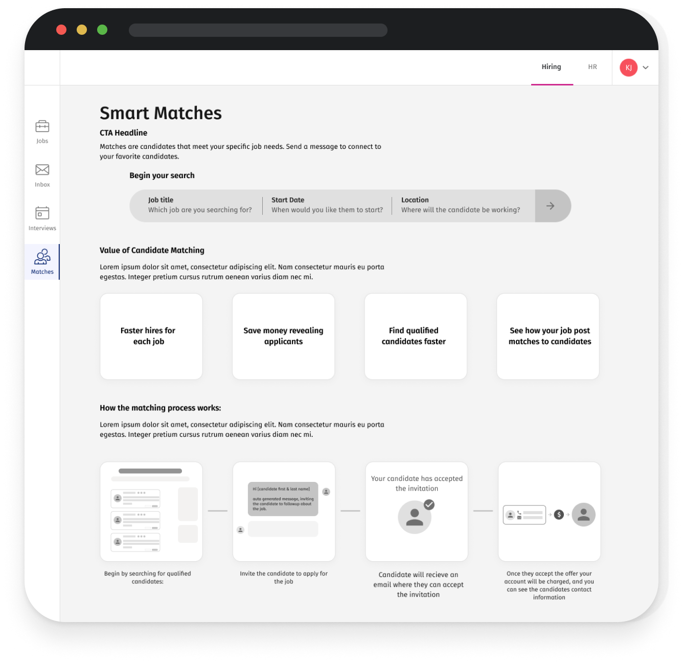
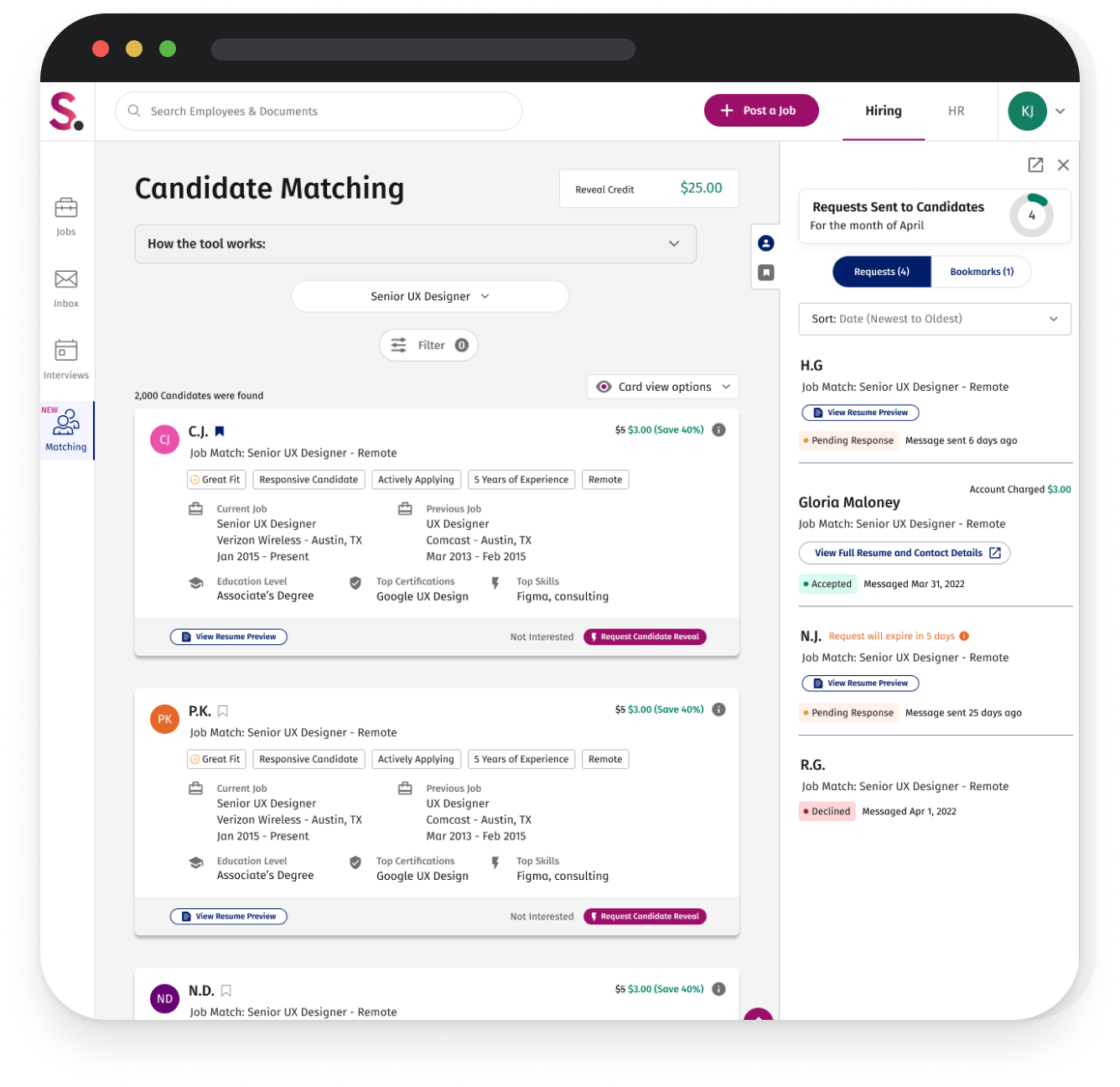
I started by creating the low-fidelity wireframes. The key elements I needed to design were a captivating landing page to inform and engage the employer about the product, an easy-to-scan search experience for employers to find qualified candidates, and a tracking system for employers to keep track of candidates they have sent requests to.
Key Takeaways + Areas of Opportunity
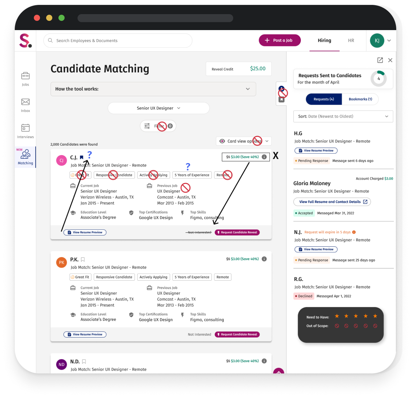
After creating the initial low-fidelity designs, we identified several design elements that needed to be changed to align with the MVP scope and provide the employer with a more easily scannable user experience.
- Eliminate the search and filtering experience for browsing candidates. It would be too much of a technical lift for engineers to pull the most qualified candidates at a moment’s notice for a detailed search.
- Highlight the upfront cost per qualified applicant. Smart Matches has introduced a new pricing model to employers with a higher incentive. Instead of paying a set rate to reveal qualified applicants, they can now do so at a 40% discount
- Reduce content overload on the card and emphasize the ‘View Resume’ button. Our research shows that employers prefer to see four key elements when evaluating a candidate: recent work experience, education, certification, and relevant skills.<
Mid-Fidelity Wireframes
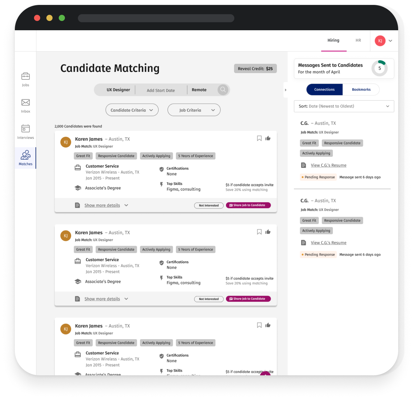
The next phase, several design enhancements were implemented. These included an accordion-style job picker for employers to select a live job they had posted, instead of using the search bar. Additionally, I replaced the side panel used to track applicants with a more accessible tab treatment to track “connections” and “bookmarked” qualified candidates, along with other UX functionality.
Key Takeaways + Areas of Opportunity
In the next testing round, we aimed to make the product more user-friendly by using familiar components and reducing unnecessary text. This resulted in a more streamlined product.
- Remove the directions underneath the header. The content was too lengthy, and we wanted to encourage the employer to discover the product and engage with it in a way that felt natural to them.
- Re-use pre-existing components. We already had a polished accordion drop-down on the Jobs product, so we repurposed it here.
- Reduce candidate card size. We needed a card size that was skimmable on both desktop and mobile, and the mobile cards looked too long with the labels included.
High-Fidelity Wireframes
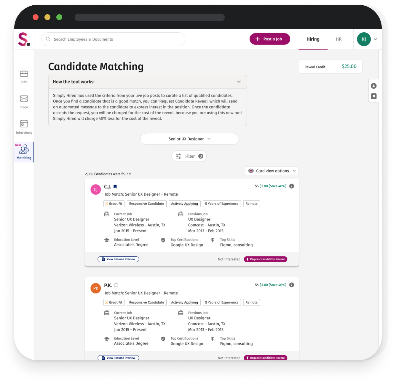
The MVP designs were refined to be more accessible, with tab names that are more recognizable to recruiters/hiring managers, simplified card styles, and content on the right to educate the employer on how smart matches are generated.
User Testing Takeaways
In the final testing phase, we conducted unmoderated usability testing using the Wynter tool. This allowed users to complete a series of actions and share their feedback on the experience. The feedback was mostly positive, with some areas for improvement that we aim to address in the next phase of our work.
- Participants thought the tool felt familiar, and it made it easier to navigate through SmartMatches.
- Participants thought they had all the important information they needed at their fingertips, and if they needed more information clicked on the preview resume.
- Participants thought it was valuable how the candidates were being matched based on the job posting.
Communicating to The Employer
The SimplyHired Applicant Tracking System (ATS) is a web-based product. Therefore, all communications to the employer are primarily conducted through email. With the launch of SmartMatches, a series of emails were created to introduce the employer to the product, inform them about new candidates to review, and keep them updated on requests made to qualified applicants.

Rolling Out The Product
The engineer build was scoped to take a couple of months to build SmartMatches, and our plan was to roll out the product to 20% of users to identify any bugs from the backend. So, we decided to create a teaser landing page to generate interest and excitement around the product release. Employers were given a brief overview of the tool with a call to action to “claim early access,” which would sign the employer up to be notified once the tool is live.
In the first 2 weeks, 94% of the employers who visited the landing page signed up to be notified, which was a very promising sign.


